
An association website has a harder job than a normal business site. It has to welcome the public, serve logged-in members, collect dues without phone calls to the treasurer, fill event seats, and keep a directory accurate — all at once, and usually with volunteers running it.
We design and build association websites every week, on the platforms associations actually use. Some of that work is design in the visual sense — making a membership platform stop looking like a membership platform. Most of it is design in the truer sense: deciding how the five hardest jobs on your site should work, and then making them work.
What Makes an Association Website Different
A restaurant website has one audience and one job. An association website has two audiences — the public you’re recruiting and the members you’re serving — and five jobs a brochure site never has to think about. Every one of them is a place where design either saves your staff time or quietly creates work.
1Member login and self-service. Members expect to update their own profile, renew their membership, and register for events without emailing anyone. When login is confusing, that workload doesn’t disappear — it lands on your office manager. The small stuff matters more than people think: we’ve fixed more than one site where the Login button still said “Log In” after members had already logged in, and the members concluded the site was broken.
2Dues and payments. Renewals, new-member joins, prorating, lapsed-member grace periods, receipts the bookkeeper can reconcile. The design question is not what the payment button looks like. It’s whether a seventy-year-old member on an iPad can renew in under two minutes without calling anyone. That’s an achievable standard, and most association sites fail it.
3Events people actually register for. Member versus non-member pricing, guest tickets, early-bird windows, capacity limits — and a page that sells the event rather than merely listing it. Registration friction is one of the few design problems you can measure directly: it shows up as empty seats.
4The member directory. At many associations the directory is the single most-cited member benefit — and the page most likely to look like a database dump from 2009. A directory worth paying dues for is searchable by name, geography, and expertise; readable on a phone; private where it should be; and gives members profile pages they’re proud to link to.
5Two audiences, one coherent site. The public face (our mission, join us, upcoming events) and the member face (my account, my community, my resources) have to feel like one organization — not a marketing site with a portal bolted onto it. This is where a design either holds together or visibly seams apart.
If your current site handles all five gracefully, you don’t need us. If reading that list produced a specific sinking feeling, keep going.
The Platform Landscape: An Honest Map
Association web design is inseparable from the platform question, so here is the honest version of the landscape — including where our own interests lie.
| Platform | Best fit | The honest caveat |
|---|---|---|
| Wild Apricot | All-in-one: membership, events, email, payments | The most capable incumbent — and the source of the single most common complaint we hear: the stock themes look dated. Fixable with custom theme design. |
| POP Members | Orgs that outgrew spreadsheet-plus-website; flat pricing | Ours. We build it, so read this row knowing that. Modern themes, one flat monthly price. |
| MembershipWorks | You love your current WordPress or Squarespace site | Embeds membership into an existing site rather than replacing it. |
| Neon CRM | Fundraising-heavy organizations | A donor CRM first and a website second — the right priority for some orgs. |
| Custom build | The association’s site IS its product | Portals, scoring systems, registries. Bigger investment, no platform ceiling. |
Two disclosures, because this page only works if you can trust it: we are a certified Wild Apricot partner, and POP Members is our own platform. We make money in three of the five rows above. What keeps us honest is the same thing that keeps this page useful — most associations that call us should stay on the platform they have and fix the design. We’ll tell you which kind you are.
For the deep dives: our Wild Apricot consulting practice covers that platform end to end (including an honest comparison of the alternatives), and for custom portals and applications, see custom web development.
A platform-fit quiz is in the works — five questions, an honest recommendation, including “stay where you are.” Until then, this is exactly what a 30-minute call sorts out.
Association Web Design Patterns That Work
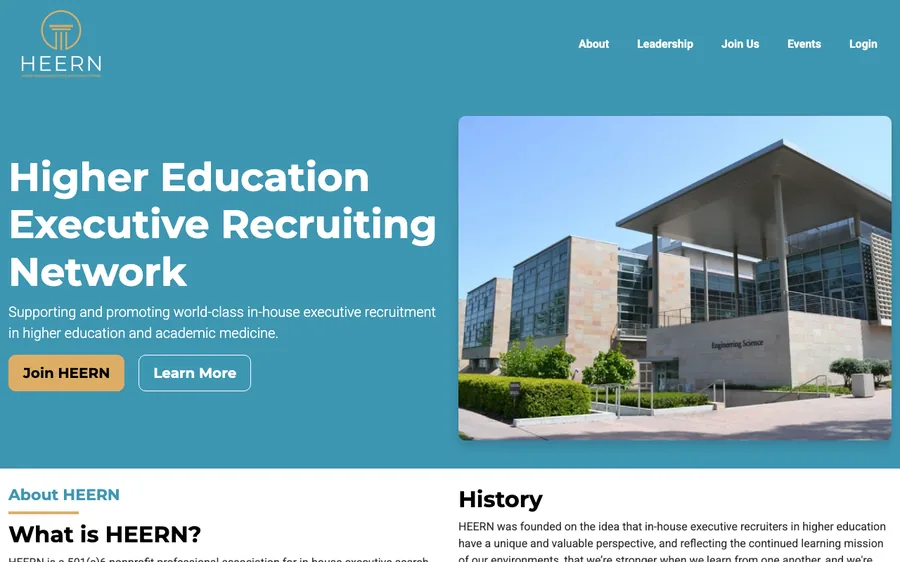
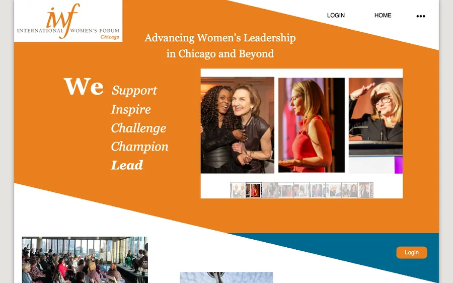
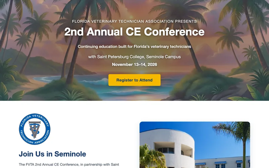
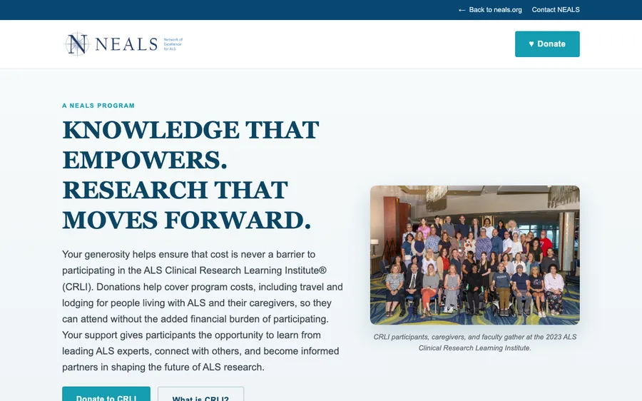
Patterns from association sites we’ve designed and built — each annotated with why it earns its place.
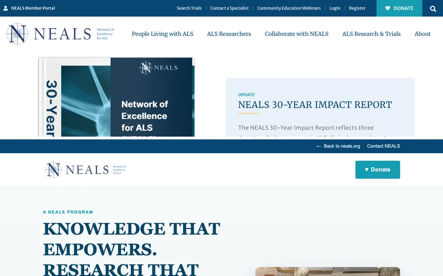
Association Website Builders: When DIY Works — and When It Stops
The honest answer about DIY: a capable volunteer with Wild Apricot’s builder, Squarespace, or Wix can get a serviceable association site live, and for a while it will be fine.
DIY keeps working while three things stay true: membership is small enough that everyone knows everyone (roughly under 200), exactly one person owns the website and enjoys it, and your events are simple. In that phase, spending money on design is premature — spend it on programs.
It stops working when the directory starts mattering, when dues develop categories and edge cases, when the board decides the site embarrasses the brand, when someone asks about accessibility and nobody has an answer, or when the volunteer who built it graduates, retires, or burns out. The classic call we get is from an association in year three of a DIY build: the site technically works, nobody knows how, and every change is scary.
Neither of these is a mistake. They’re phases. The design question is simply which phase you’re in — and whether the transition happens on purpose or by emergency. (The same arc holds for membership website design beyond formal associations — clubs, networks, and subscription communities hit the identical wall, usually in the identical year.)
What Association Website Design Costs
Real numbers, because pricing pages that say “it depends” waste your afternoon:
- Design refresh on your current platform (your content, new design, same platform): $1,500–$3,500
- Full design and build on a membership platform (Wild Apricot, POP Members — design, configuration, migration, launch): $3,500–$8,000
- Custom member portals and web applications (scoring systems, registries, tools that don’t exist off the shelf): project-priced — see custom development
- Ongoing: technical maintenance and support for the site runs $250/month and up, or folds into platform hosting — IT for the website, not association management.
Every project is fixed-price and bounded: you approve a number before work starts, and you own everything at the end — the design, the accounts, the content.
Our Typical Project Flow
1Discovery (week 1). What’s working, what isn’t, who maintains it, where members get stuck. We read your renewal flow like a member and your admin like a volunteer.
2Design in your brand (weeks 2–3). A clickable design of the pages that matter — homepage, join, directory, events — in your organization’s visual language. You approve or modify before anything is built.
3Build on your platform (weeks 3–6). Theme development, configuration, forms, payment flows. On your platform, in your accounts.
4Migration and launch. Content and member data moved carefully, redirects preserved, launch on a quiet day — and training for the person who’ll run it, recorded so their successor gets it too.
Four to eight weeks, start to launch, for most association projects.
Frequently Asked Questions
How much does association website design cost?
Most association projects land between $1,500 (design refresh on your existing platform) and $8,000 (complete design, build, and migration onto a membership platform). Custom portal development is priced per project. Everything is fixed-price before work begins.
How long does an association website project take?
Four to eight weeks for most projects: discovery, design approval, build, migration, launch. The most common schedule risk isn’t the build — it’s content decisions, so we front-load those.
Can we keep our current platform?
Usually, yes. Most associations that call us have a design problem, not a platform problem. We design on Wild Apricot, POP Members, and WordPress-based stacks, and we’ll tell you plainly if your platform is genuinely the obstacle.
Do you work with associations outside California?
Yes. We’re based in Santa Barbara, California, and work with associations nationwide — Chicago, Florida, and Boston among the current roster. Association work travels well: everything happens over screen shares and staging links.
Who owns the website when it’s done?
You do. Your platform account, your domain, your content, the design files. No hostage arrangements — it’s your members’ site, not ours.
Get a Website Your Members Actually Use
Tell us what’s not working. We’ll tell you honestly whether it’s a design problem, a platform problem, or neither — and if it’s neither, we’ll say so and you’ve lost nothing but half an hour. Bounded projects, fixed prices, no retainers required.
Start the Conversation